The familiar Pantone colour chart was first developed as recently as 1963, but it’s already become almost universally recognisable. When we think of how to choose and combine colours, it is the image of the Pantone chart that comes to mind. Originally presented to a largely anologue world, its uses and references have now extended into the digital world where it is used in the precise reproduction of colour in both digital and real world applications.
Its imagery is now so ingrained in our culture that when we see something that resembles it that dates back to the 17th Century it brings us up short.
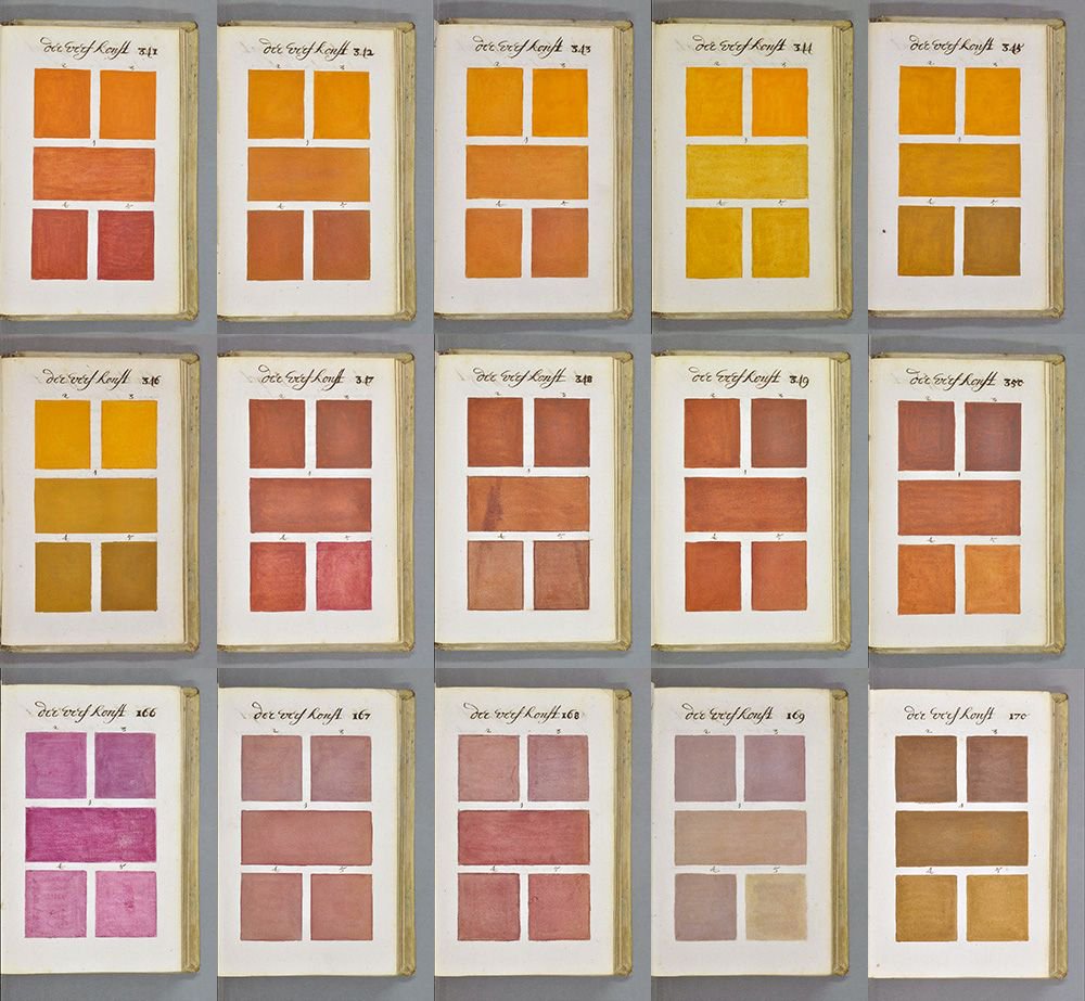
In a small library in the French town of Aix-en-Provence is a book that was painstakingly produced by a Dutch artist called Boogert in 1692 to share with the world his ideas about how watercolours could be mixed when painting to maintain a degree of consistency in their reproduction. In other words, not only does it evoke the Pantone chart visually, it serves broadly the same purpose and proves there is nothing new under the Sun.
According to historians, the detailed 800 page manuscript was written and painted meticulously by hand so only one copy was ever produced, making it of limited use as an educational tool in its own time. Fortunately some things do change and the manuscript is now available to view online, predictably and appropriately enough on Pinterest, making it freely accessible to the planet and allowing us to share these images from its pages. The Traité des Couleurs Servant à la Peinture à l’Eau (a Treatise on the use of Watercolour Paint) was doubtless groundbreaking in its own time but is breathtakingly forward thinking in the way it presages how we use colour in the 21st Century.